Sunday, December 6, 2009

Wow, W. Dallas Victory


Whatever, whenever. Who could ask for more?
Well, take a look at this striking full page, full color ad for W. Dallas Victory Residences....
Where you will discover the wow factor that comes in living in one of the nation's most dynamic urban neighborhoods. The image instantly sells the warmth and the view. Well written ad copy transforms casual interest to desire for more. With phone and website contact info you know it's time to act. Before they are all gone.

Sunday, November 29, 2009

Enter to win nets results


Can't miss the excitement in this 300x250 for Excalibur in Las Vegas.
Newspaper websites across the country seem to carry this one that offers an enter to win for a chance to experience New Year's Eve in Party Town, USA.
Her smiling face and raised glass call to any and all who are interested in a chance to win.
Graphics in this ad are sin-sational.

Sunday, November 22, 2009

Picture yourself playing Pinehurst


So you are flipping through the pages of The New Observer (Raleigh, NC) and you happen upon this handsome b&w ad. Almost all will pause to read the headline but avid golfers will dream of standing over a putt on Pinehurst No. 2.
Kudos for the designers for choosing to use the photo to fill the ad space. I also like the artful way the headline and ad copy tell the story without detracting from the scene.
The price isn't cheap-- $222 per person per night for room, breakfast and a round of golf. Response should be strong from those who know the value of the package is priceless.

Friday, October 23, 2009

Take Your Sweetie to Tahiti


Clever headlines often make you remember the ad message. This one-- Take Your Sweetie to Tahiti-- hits the mark atop this photo depicting a couple relaxing by the pool.

The offer is a screaming good deal (airfare and 4 nights from $998) and likely will cause paradise vacation shoppers to book the trip.

Bet on better response with a sentence or two selling the benefits of this South Pacific getaway package including some of the fun things Tahiti has to offer.

And from the neck down this ad needs a makeover. Change the font for the ad copy to something snappy and bold the phone numbers so they are easier to spot.

Sunday, October 18, 2009

Keep your business top of mind

Quick, name a Hair Salon in Norman, Oklahoma. Being Top of Mind means more customers will prefer your firm to the competition.

Small space ads like this one-- especially when they run every day-- leave a lasting impression on consumers. The repetition that comes with frequency will grow your name awareness. Watch your sales soar. Best of all you see more new customers, repeat customers and referrals and without offering big discounts to get them in the door.

I like this one for the pretty face with her trendy style. Better to put a big benefit headline at the top and move the name to the bottom. Address and phone can be set smaller. Do this so more people will pause to read it and remember your name.

Sunday, October 4, 2009

Campbell's ad sells less salt


This newspaper ad is suitable for framing.
What a beautiful ad from Campbell's promoting its low salt Tomato Soup. Ran to day in the News Tribune (Tacoma, Wa.).
See how they used blue skies, clear seas and the shell to show that the world's best sea salt let's them use less salt to make their tasty soup.
Powerful branding for this time of year.

Monday, September 28, 2009

How much is 25% off?


The lady in the ad is screaming for joy because Jetson's in Ft. Pierce, Florida is offering 25% off matching pairs of Whirlpool front loaders.
Style points for the look and layout. The signal is clear. And the big bold benefit headline jumps off the page.
Unfortunately the message is short on proof. 25% off what? Add the regular price and the savings-- provided the specifics prove it's a smoking hot deal-- and response will spike.
Otherwise, it's just another pretty ad.

Tuesday, September 22, 2009

No one beats Walmart


Rarely do you see a display ad in newspapers for Walmart. This one is bound to deliver strong response.
Full page format makes the message loud and clear. Instantly you know Coke products are priced to sell with a bold promise that no one beats Walmart's "unbeatable prices."
$4.98 for a case of Coke. Wow. That's scary.
And in case the competition is thinking of going lower? Walmart is willing to match any local competitor's printed ad.
With ads like this the product will be flying off the shelves.

Sunday, September 6, 2009

Home buyers respond to $8000 tax credit


With the Dec. 1 deadline looming for the government's $8000 tax credit, response will be high for ads like this one from ReMax in Knoxville, Tn.

This leaderboard's simple design and strong call to action-- see if you qualify... click here-- means more people will see it and respond.

The ReMax balloon and logo add credibility to the offer.

Certain restrictions apply and driving consumers to the ReMax website solves the impossible task of showing all of the details in the 728 x 90 space.

Buy plenty of impressions and expect a higher than average click through rate with this one.

Tuesday, September 1, 2009

What's bugging your business?


Do you know what's bugging your business? Better call Kennedy and Coe. That's what many biz owners may do after seeing this cleverly designed and written ad message from the Kansas based CPA firm.

The blood sucking mosquito gets our attention for it's not what we expected as we read the pages of the Wichita (Ks.) Eagle. The headline makes us laugh because even if you don't know a lick of Latin you can translate "drained profits."

The balance of the ad copy reassures the potential client that the answers to their problems may be a phone call a way.

What are you waiting for? Pick up the phone!

Sunday, August 23, 2009

Artsy ad for Tlingit glass creations


What a winner from the Museum of Glass in Tacoma.
Designers used a photo to play up a piece created by Preston Singletary to show museum visitors a sample of what's in store when they tour his Echoes, Fire and Shadows, now through September 19.
The fonts, shades and colors balance the bold and simple look.
The ad copy includes plenty of particulars but misses the point that was instantly clear with a visit to the museum's website--- Preston magically mixes his Tlingit ancestry with dynamic studio glass moves.
Sell the sizzle.

Sunday, August 16, 2009

Classy ad for Date Night


I like this one for the way it sells a good time with someone you love. Eye catching. Good ad copy. Short, sweet, but sells the value of every night's deal. Graphics that sell the experience, then the tasty treats.
Truluck's in Austin, Texas invites you make every night date night.
And I'll bet this ad fills the house.

Sunday, August 2, 2009

Who's the Best Realtor?

Thousands sell real estate in Dallas, Tx. Only one can claim to be the best Realtor. Nathan Kaul with Keller Williams. Home buyers and sellers looking to hire a top gun will stop and look at this ad. And they will keep reading because the ad is attractive and the benefits are clear. Boost reader response with a quote from a satisfied customer rather than from Nathan himself.

Saturday, July 25, 2009

Sweet Deals on new homes


A scoop of ice cream in the height of summer is bound to get everyone's attention. And the headline-- Sweet Deals-- begs the reader to discover more.
Copy is well written and clever.
You might think this ad should get high marks for effectiveness.
Problem is that serious home buyers, and the number grows each day as the market rebounds, might miss this display ad because it forgets a basic rule: newspaper ads have but 2 seconds to get the reader's attention. And the readers that count are the ones that are warm or hot prospects.
Make the ad larger, add a photo of a happy couple stepping across the threshold of their new home at Alamo Creek and the marketers at Shapell Homes are likely to see higher traffic counts this weekend at their model homes.

Sunday, July 19, 2009

Tee It Up at Golf Town


Shopping for golf clubs? Impossible to miss this powerful ad that ran recently in The Calgary Herald.
First you can't help but notice the almost large as life over sized driver that seems to leap from the page. And the chance to save on Nike Golf-- particularly if you are a fan of the brand-- makes it tough to turn past this one.
The proof is in the ad copy with regular price, big sale prices and the savings calculated for you.
Golf town is likely to drive it long and straight with this one.

Sunday, July 12, 2009

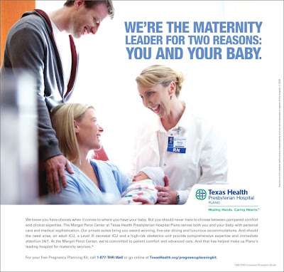
Oh Baby!


Dallas moms have plenty of choices when it comes to choosing a hospital birthing center. Some may change their minds after seeing this display ad in the Dallas Morning News.

Moms and dads to be may see themselves in this layout. The headline sells the benefits of Presbyterian Hospital. Then the ad copy closes the deal with words that assure pampering, expertise, luxurious private rooms and when necessary the high risk OB unit.

High marks for this one.

Sunday, June 28, 2009

Better way to beat the heat


Summer's here. It's going to be hot.

Colorado Comfort wants to be your HVAC solution.

This quarter page display ad features a pretty face with Popsicle in each hand. Effective because its funny and not what you were expecting. Gets your attention.

The benefit is strong too with the price broken down to just $3.00 per day.

Call to action is clear with deadline to take cash in on the savings.

Graphically the ad is weak from the neck down. Easy to fix by using snappier fonts and up sizing the logo.

Fun way to sell the product.

Saturday, June 20, 2009

Dad Eats Free at Duffy's


Among more than 70 restaurant ads today on the website for Treasure Coast Newspapers, this one caught my eye.

It was the headline.

Dad Eats Free on Father's Day.
(It Doesn't Get any Better Than That).

Now, I've never been to Duffy's but have to admit the offer is tempting. And the three photos of the dishes offered add to the lure to check this place out.

Notice the coupon at the bottom-- a great way for the restaurant to track the response.

Then they closed the deal with the tie to the U.S. Open and Duffy's big screen TVs.

Score one for Duffy's.

Monday, May 25, 2009

Cowabunga: good ad copy


Maybe he's your dad or a grandpa. Either way you know that if you put a skateboard in his hands he's likely going to need urgent care. That's the point of this ad from KPS Health Care in Bremerton, Wa.
The photo gets your attention because its not what you're expecting. The headline is fun and has you reading for more.
Well written ad copy makes this ad effective. Click on this ad so you can read the type: Bob has hit another phase in his life...he bought a skateboard and is trying to keep up with the kids. KPS Health Plans promises to be there with Bob every step of the way. Live it up Dad!

Saturday, May 16, 2009

What are you waiting for?


The headline grabs you-- for two reasons. The wording and its graphic dominance at the top of the ad.
The call to action is strong with a promise that These Homes at these prices won't last long; then proof with SOLD stamped on two of the properties.
Build desire and sell the value by adding a big more description for each of the model homes.
The map give you a sense of place. The contact info is complete with www.mccalebhomes.com.
Pound for pound, this is a good one for a builder in a market that is starting to pick up the pace.

Friday, April 24, 2009

How do you measure success?


Some ads are meant to make the phone or cash register ring. Others like this one speak to current customers with an indelible branding message.
First People's Bank does a smart job of branding as they make a point about their 10 years in business.
I like this ad for its strong signal-- the image of the boy reaching out to tell you he's 10. And the copy is well written, inviting you to take part in the celebration.
Effective ads like this one make you feel good. Generally, ads that make you laugh or cry are the ones you remember.

Saturday, April 11, 2009

Doctor, is that you?


Okay, many recruitment advertisers have take their postings to the web but there are still some great examples of powerful newspaper help wanted ads.
Take this one, for example, from the Denver Post.
Graphically this message calls to the doctor who may be the next Director of Surgery at Platte Valley Medical Center in Brighton, Co.
The photo does the selling. Her eyes speak to the hard-to-find candidate who is compelled to stop and ask: is this position the perfect fit for me.
Effective ads like this serve as interruption advertising, stopping the passive job seeker for a moment when they least expect it.

Sunday, April 5, 2009

Entire store is on sale


Shopping for women's apparel and reading this weekend's pages of the Vero Beach newspaper? This display ad for Frances Brewster (tcpalm.com) is bound to get your attention.
First, the signal is clear. Your eyes are drawn to the photo of the young woman, smartly dressed.
Next, the benefit headline shouts the entire store is on sale with savings 30-70% off.
Repeat customers will probably respond. Others may turn the page, skeptical that the offer is too good to be true.
My advice: add an example of an item on sale with its regular price, sale price and savings. Ads like this deliver better results with all three elements-- signal, benefit, proof.

Sunday, March 22, 2009

Print ad offers 24 hour convenience


We make it easy.
Simple as that.
Anton's Cleaners with 44 locations in the greater Boston area and beyond offers this print ad with a simple benefit (We Make It Easy) and they prove it with 24 Hour Drop Off.
The layout is clean, the type is bold and the white space makes the message jump off the page.
Potential clients in a hurry might miss this message in the Marshfield Herald News for its lack of graphic hook. Add a phone number for more info and a photo of a happy customer dropping off her laundry to score better results.

Saturday, March 14, 2009

Casino calls: spin to win


People who love the Casinos may find this ad impossible to resist. Found this print ad this morning in the San Jose Mercury News.

Non-gamblers might skip it but players, overly sensitized to the lure of winning, will stop and look. That's because the designers used a powerful image of two happy ladies presumably just hitting a jackpot. Consumers instantly imagine being there too.

The bold headline promises $500 winners every 20 minutes. And notice the teaser below for the chance to win $750,000.

I like this one. It makes you feel good.

Thursday, February 26, 2009

Are you ready for some Sun?


It snowed last night in Seattle-Tacoma and probably a lot of other places in the northern hemisphere. So how tempting to stop and examine this skyscraper for the RIU Hotel & Resort in Cabo San Lucas.

Effective ads make it easy for the target audience to picture themselves using the product. In this case I'm sitting in a cabana chair, about to sip from a drink, holding the little umbrella with my finger and thumb.

The offer? All inclusive from $102 per day.

You just have to click for more info, don't you?

Sunday, February 8, 2009

Mighty banner for McDonalds McMuffin


Hard to miss this 300x250 message from McDonalds this morning on the Atlanta Journal Constitution website (http://www.ajc.com/). It's posted across news, sports and other channels to reach online newspaper readers ready for a dandy deal on a Sausage McMuffin with egg.
Many online banners are designed to make you click. Not this one. They want you to drop what you are doing and drive to Mickey D's for breakfast.
Simple design, clean layout, powerful colors and a great offer.
The best part? Impressions for this banner seem to be served only in the morning.
Expect great response from this one.

Thursday, January 29, 2009

Ad for Nissan Murano hits target


Discovered this 300x250 banner for Nissan's 2009 Murano recently on Yahoo. The design and color combination are powerful. Eyes are drawn instantly to the 0% APR. The sporty SUV is the center of attention. The flash file delivers the message swiftly and clearly... if you want one, click here.
Ads like this one are designed to brand the product and generate click thrus. But some will call and others will visit the local showroom.

Thursday, January 15, 2009

New look after Lasik


Considering Lasik? You may find it hard to resist this message for Florida Vision in the Stuart (Fla) News.

First thing you see in the word LASIK, then you can't help but look at her face and imagine life without glasses. Wow, how life would be different!

The ad is artfully designed though a bit busy with a few too many copy points. Better to cause readers to call or click to the website.

Here's a case where less is more.

Thursday, January 1, 2009

Time for Tiger


This week is Tiger Week on the Golf Channel. Ben Bridge Jewelers may have timed this right with this striking ad in The Denver Post. How many golfers would like to play like Tiger? Or to wear a TAG Heuer time piece that Tiger endorses? Many fans wait anxiously for Tiger's return in 2009. The Golf Channel programing this week feeds that frenzy. Ads like this one that tap that national exposure are well timed, brilliant.
As for the ad itself--- winner written all over it. The layout is simple, the photography stunning, the signal crystal clear, the benefits bold and the proof in the ad copy.
Bravo.